Photo Retouching

Our offer comprises a vast selection of tailor-made services designed to bring your products to the next level. We excel at taking your images and removing or adding elements, seamlessly integrating graphics, and conceptualizing realistic 3D mockups directly from your photos. We also pay special attention to the delicate finishing touches, such as precise colour saturation and tone balance, to ensure an impeccable visual result.

Our team, made up of seasoned creative professionals, is committed to consistently respecting your deadlines, all while providing exceptional service, the quality of which surpasses industry standards. Thanks to our mastery of advanced photo-retouching technology, including AI, and our suite of the latest generation of software, we bring out the best in your products by giving them the treatment they deserve.

McDonald's Logo
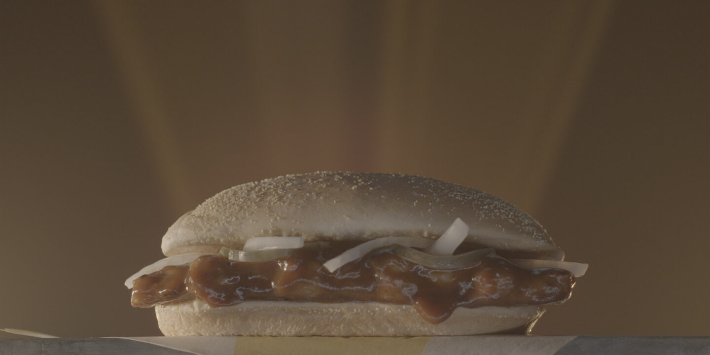
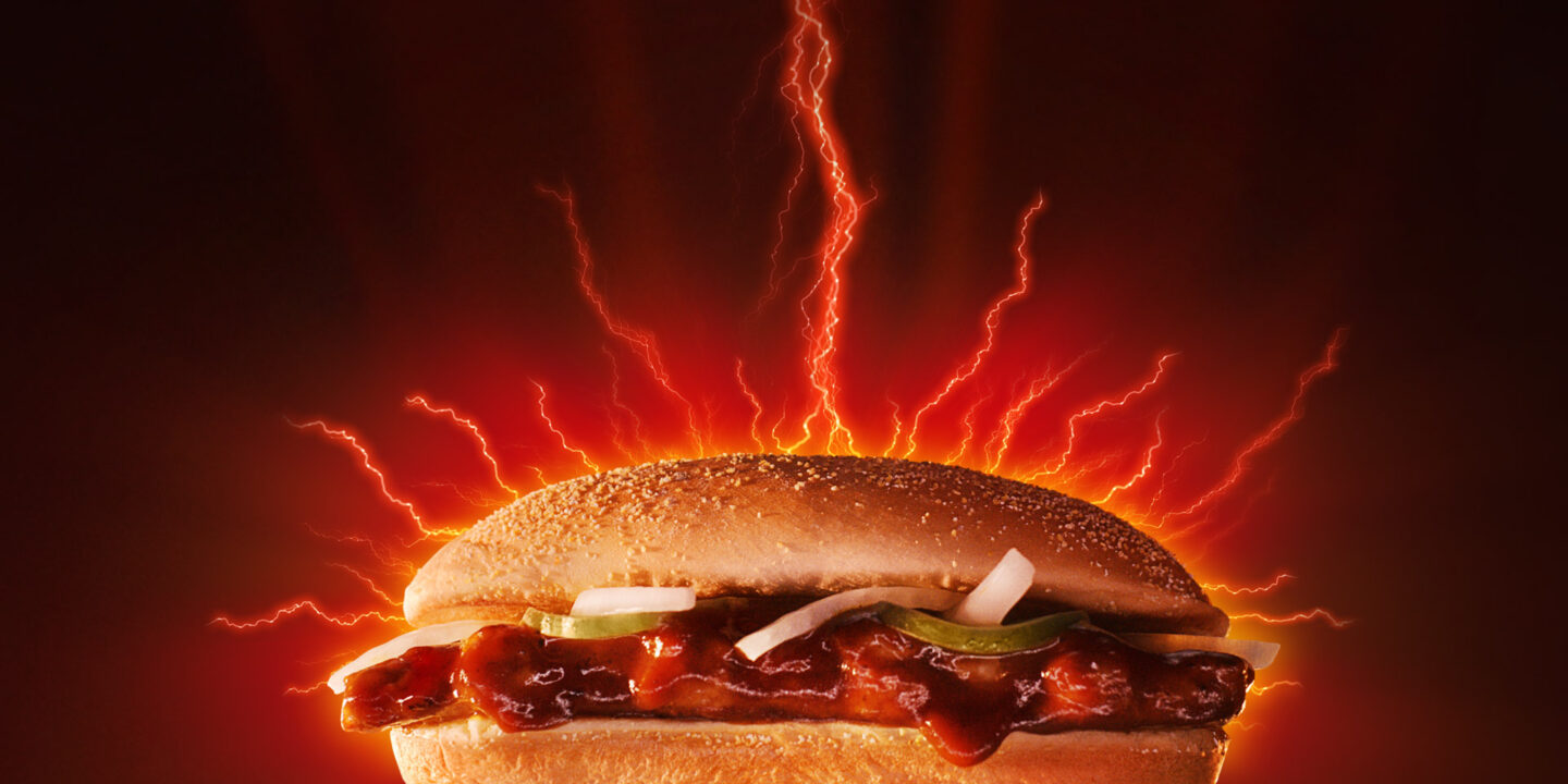
The agency Wieden+Kennedy called upon our expertise to help with the launch of McDonald’s McRib campaign.

McCôte

The client, McDonald’s, wanted the McRib sandwich to look delicious and top-quality in the final image, which was to be adapted for a variety of platforms (digital and large-format print). Our retouchers first carried out technical retouching to improve the quality of the files and guarantee a high-quality rendering. They then performed creative retouching to add graphic elements to the existing visual, giving it a more realistic and mouth-watering appearance. Armed with but a simple video capture at first, our retouchers had to isolate the initial image to ensure it was large enough for each version of the Canada-wide campaign. Every aspect of the sandwich was painstakingly edited to make it stand out, after which everything was integrated into a dramatic environment composed of hints of oranges and glimmers of lights, as dictated by the concept designed by Wieden+Kennedy.

Before After

BRP Logo
For this campaign, our team retouched 13 images depicting Sea-Doo watercraft drivers in scenarios that complied with Japanese safety standards.

BRP_Sea-Doo

Initially produced according to North American standards, the photo session had to be modified to respect the standards of the country in which the visuals would be distributed, i.e., Japan. For each of the 13 images, we needed to give the driver gloves and boots, a process that required us to recreate these elements and thereby conduct a thorough search through our graphic and image libraries for gloves and boots commercially available in the Land of the Rising Sun. We also performed basic retouching, which included adjusting colours to depict a sunny day, saturating colours, removing unwanted elements, aligning the horizon, and adding details in bright or dark areas, all within BRP Global’s quality standards.

Before After
Before After
Before After
Before After
BRP_Sea-Doo
BRP_Sea-Doo_GROUPE
BRP_Sea-Doo_fille_avant
BRP_Sea-Doo_couple

Loto-Québec Logo
Together with Sid Lee, we created a primary visual adapted to the RGB and CMYK colour modes.

Jour_Chance_Horizontal_RGB

We then undertook the production of a 13″ × 19″ poster for CMYK printing. To do this, we went off the mockup created by Sid Lee’s artistic director, using it as inspiration for conceptualizing a vertical poster depicting an AI-generated backdrop of clovers. We then concentrated on improving this backdrop by adding several four-leafed clovers, enriching the environment and cleverly framing the image of a lottery ticket. We tweaked a variety of parameters, such as the exposure, contrast, hue, saturation and brightness of the colours; we also added special effects like filters, textures and blurring to elevate the final visual.

We also reworked the original lottery ticket to simplify it visually, accentuating the lighting to give the ticket more depth and adding beams of light in the background to draw in the eye and make the visual more appealing. The title at the top of the poster was created in 3D so that it integrated seamlessly into the depth of the image. Lastly, we emphasized the colours and contrasts to give the completed poster additional zest and boldness.

Before After

Guru Logo
For this national campaign, we created 13 images following the CMYK colour mode, then we adapted them to the RGB colour mode to meet the client’s digital needs. These images were then iterated into seven primary and six secondary concepts.

Fille_Après

Constructing the images in a photo montage for each concept was no simple feat, as it involved stock photos, shots provided by the photographer and the creation of visuals resembling “waves of foliage.” This process required meticulous cutouts of various elements provided by the client, such as plants and characters, to create well-balanced compositions. Each wave was modelled after the character with whom it was associated, adding a unique flair to each composition. Given the challenge of collaborating with so many different teams, our main goal was to ensure that the whole campaign remained both realistic and coherent throughout.

Before After
Before After
Before After
Fille_Après
Basketball_après
Course_après

Cirque du Soleil Logo
We were tasked by our partner agency Sid Lee to spearhead the Cirque du Soleil account by creating three key visuals representing characters from the ECHO show, performed in Montréal’s Old Port.

Retouche d’images_Cirque du Soleil

These visuals were meant to highlight the distinct personalities of the characters and reflect the show’s artistic universe. To do this, our team took photos of the characters taken in studio and added decor and costume elements, most notably a 3D depiction of the tubes in which the acrobats work their magic during the show. Using these key visuals, we created digital visual iterations for the entire campaign.

Before After

Dive into our universe

Discover our other case studies

Skip to Main Content

This site is registered on wpml.org as a development site. Switch to a production site key to remove this banner.